CIEM for DevOps Teams
A developer-first Cloud Identity & Entitlement Management platform, making service-to-service access in Kubernetes visible, explorable, and safe to change.
A deeply technical product, with a deeply human problem.
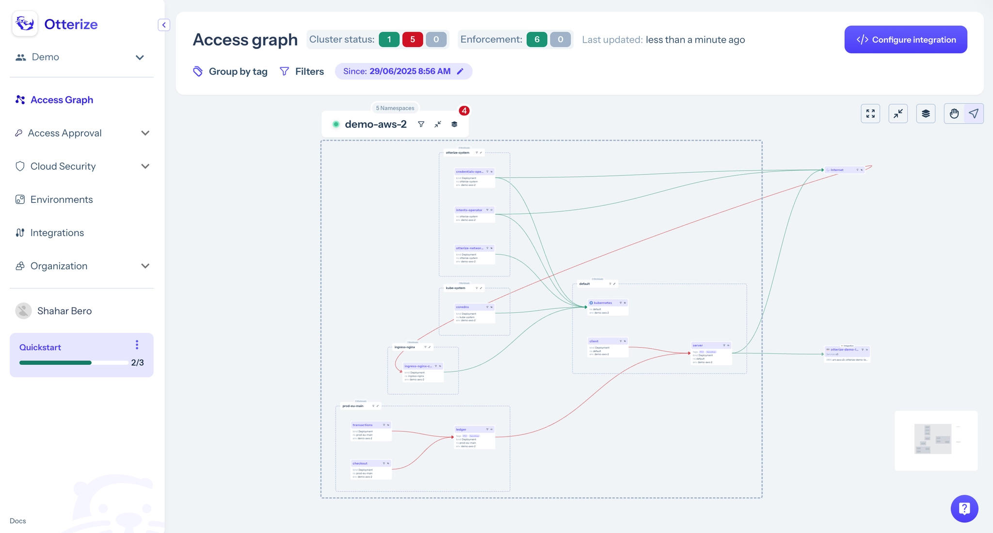
Otterize is a developer-focused IAM platform for Kubernetes. Its flagship feature, the Access Graph, visualizes service-to-service permissions in real time. Complex infrastructure data, rendered so you don't want to close the tab.
The product in motion, including the Access Graph I designed
I didn't wait for a seat at the table. I built the table.
Every week, Ori (CTO) and I sat down and figured out what actually mattered: what to ship, what to cut, what a customer was waiting on. I wasn't a ticket executor. I was a thinking partner.
Weekly CTO sync
Align on what's real, not just what's queued.
Decide what matters
Prioritize against customers & sales reality.
Design & ship
Sometimes a new feature within days of a call.
↻ repeated weekly: design embedded in the decision, not downstream of it
PostHog doesn't lie.
I used session recordings to watch real engineers try to use the product. Not in a lab, in the wild. Those recordings shaped most of my biggest redesigns.
Real engineers: confused, clicking the wrong place, giving up mid-flow
Prototype first. Spec never.
I stopped writing specs early on. Instead: prototype, share with eng, adjust.
- Devs could see the actual flow, not a paragraph describing it
- They could poke holes and flag what was technically impossible
- All of it before anyone opened a JIRA ticket
Prototyped before a line of code was written
I showed up to the standups.
Design doesn't end at handoff. I joined implementation reviews and caught the things slipping through the cracks.
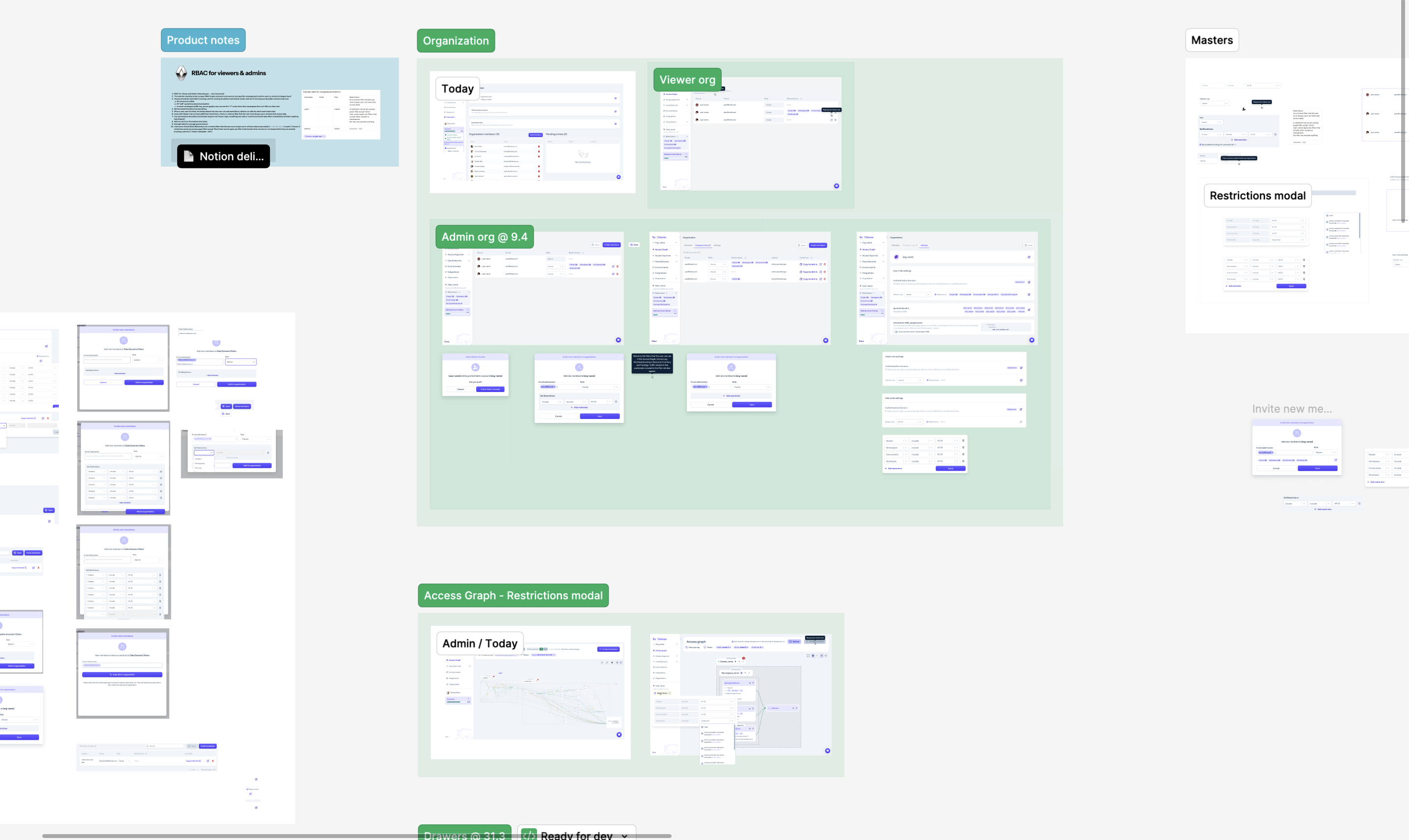
One source of truth: components, states, and feature pages, ready for dev
The Access Graph. From cluttered to explorable.
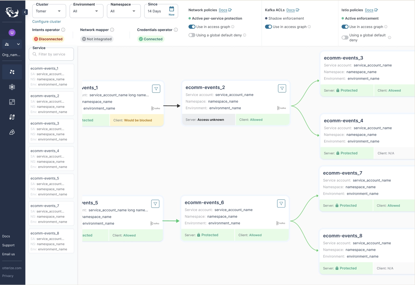
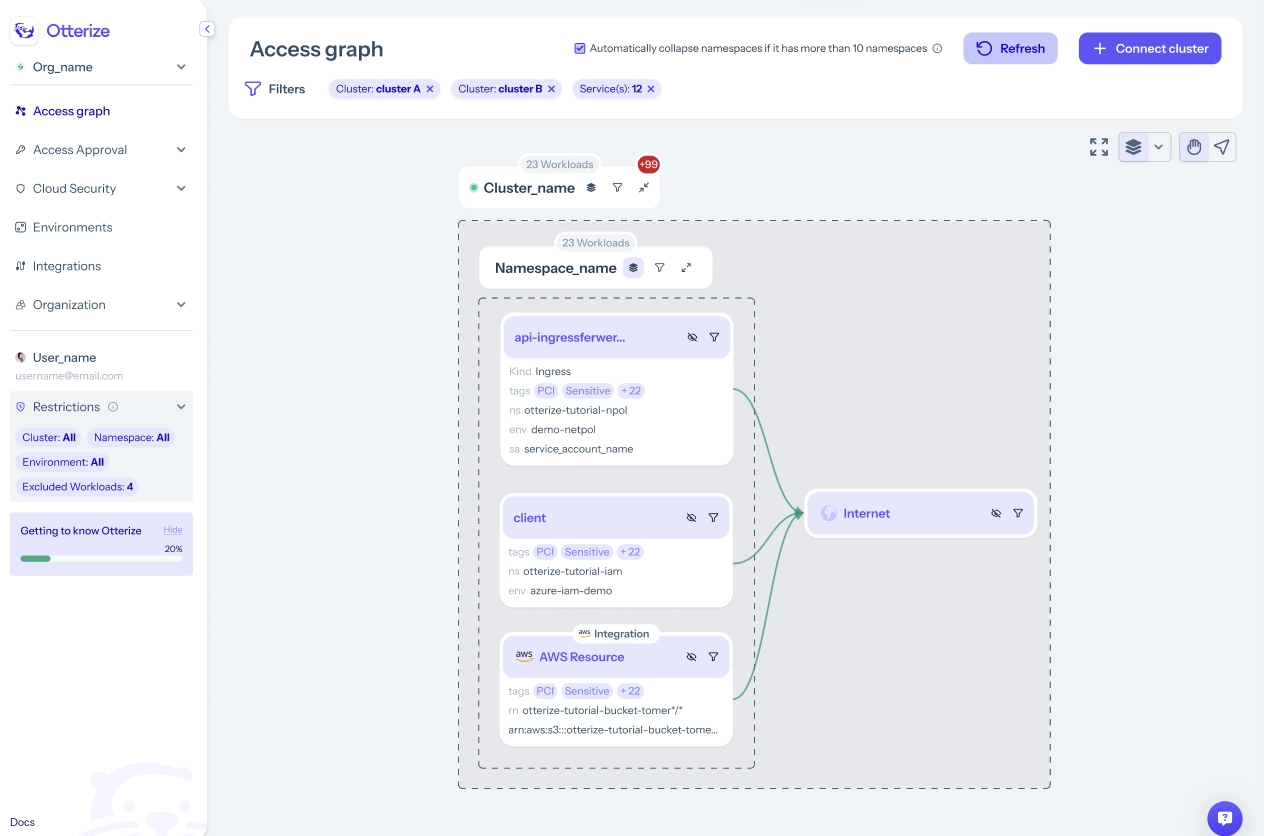
what_i_changed
- A card-based visual language for scannability
- Grouped by cluster & namespace, collapsible with contextual filters
- Structured columns that make directional flow intuitive
- Standardized spacing, color & icons, built to scale
the_payoff
The popup that wouldn't die.
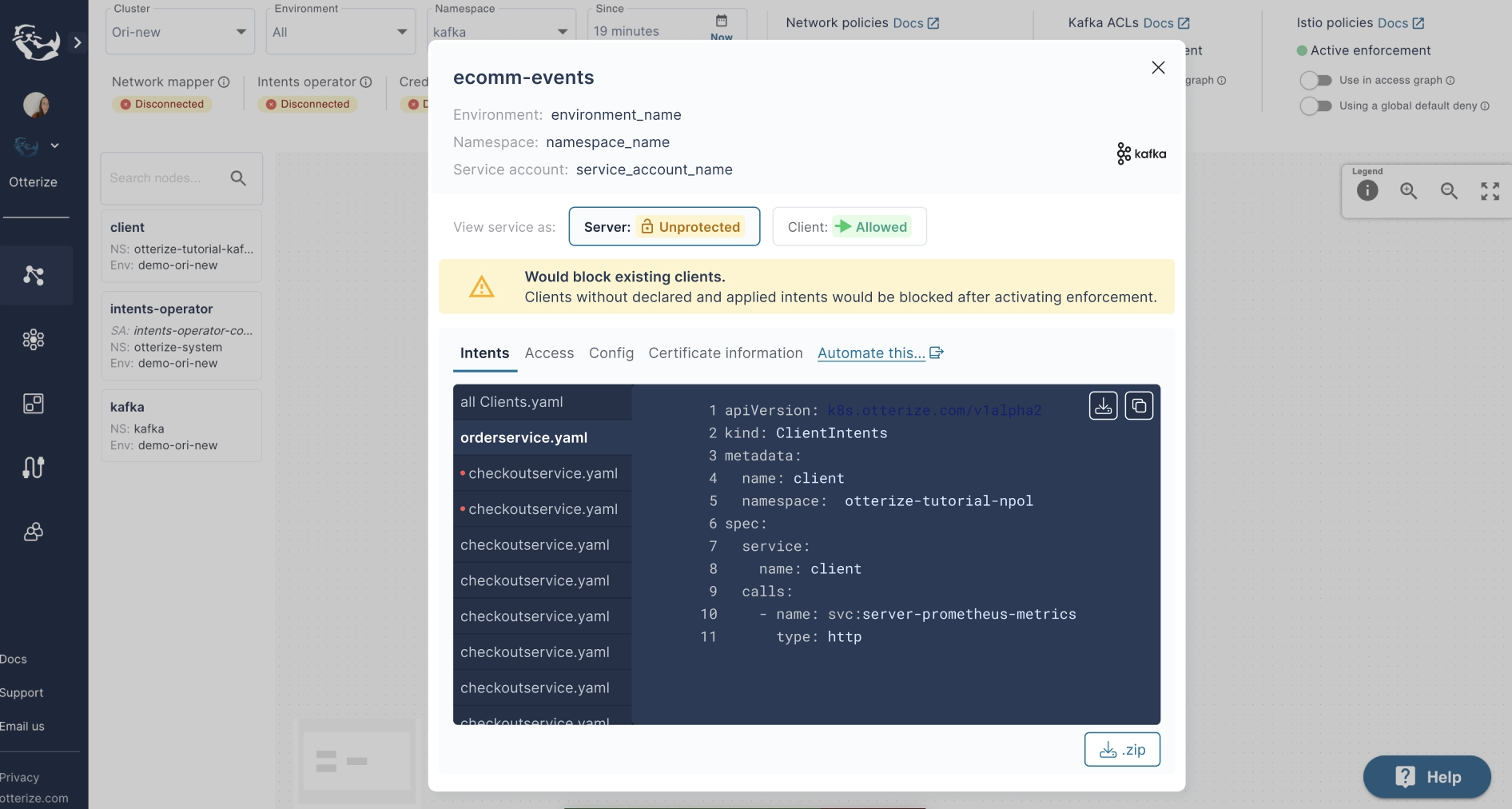
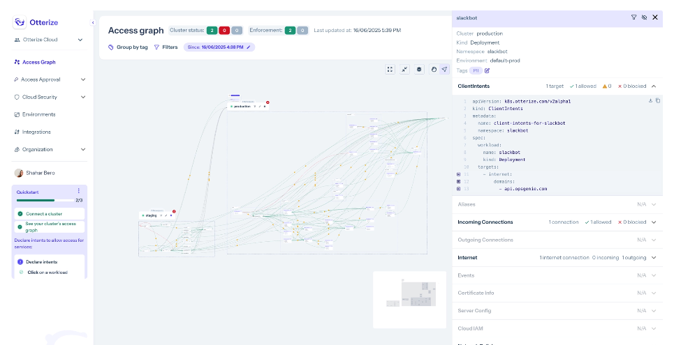
It started as a small overlay for node details. Then a tab bar. Then YAML previews. Then warnings inside the previews.
Nobody made a bad decision. We just never stopped to ask whether the popup was still the right container.
What I actually learned.
Clarity is an outcome
The Access Graph taught me clarity is something you design for, never a default you inherit.
UX debt is quiet
The popup taught me debt isn't born in bad design. It's born in good intentions, accumulated silently.
The best decisions I made at Otterize were the ones where I pushed back, slowed down, and asked: are we solving the right problem?